Key Takeaways:
- Even in a seller’s market, it pays more to be mindful of how you present your home—and color is a key component!
- This year is all about earthy greens, fun pastel blues and yellows, and smart neutrals to really create a sense of comfort.
- Have fun with DIY projects and go hunting for unique antiques to transform traditional rooms into flexible spaces!
Home Buyers Are Searching for Comfort and Versatility
Even though 2022 is predicted to remain a seller’s market, a little effort upfront will go a long way towards closing. You don’t need to do a major renovation to bring modern trends and styles into your home, regardless of its age. Clean, neat, and orderly homes certainly help, but the right color palette can really add some extra oomph.
Here are three of the leading staging trends and top color palettes that can help add value to your home and bring in bids.
Invite the outside in through shades of green
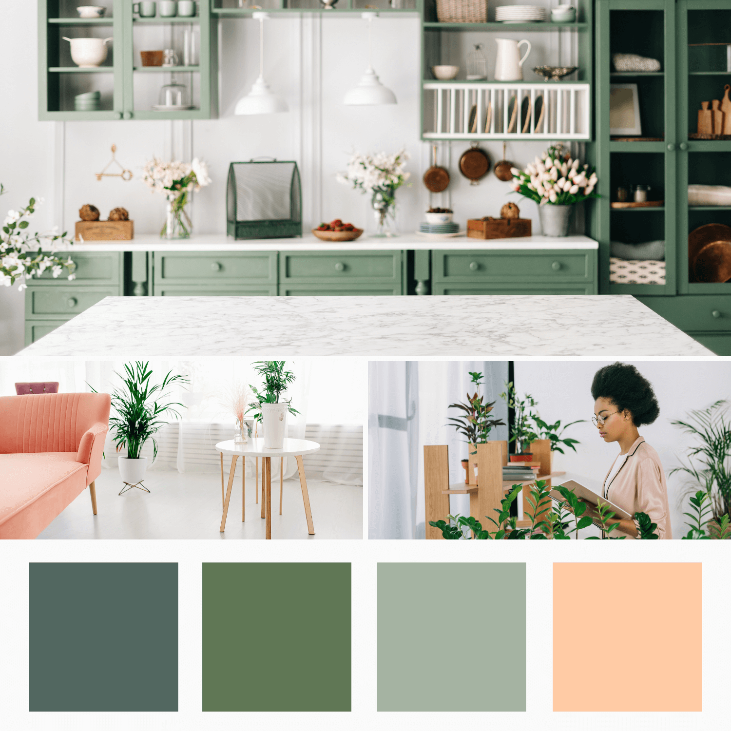
After a tumultuous few years, 2022’s trends are focused on self-care and comfort, which are reflected in soothing color schemes. The right colors can bring a sense of belonging into your home. With an overall emphasis on wellness, it’s no surprise that homeowners are falling for hues that are reminiscent of the outdoors.
Earthy, organic palettes provide balance and a breath of fresh air. Green is easy on the eyes, inspiring, and provides a sense of security and belonging. Colorful kitchen cabinets are a relatively quick paint project and very on-trend for 2022. Herbaceous colors such as sage, mint, and thyme tie in perfectly to the gastronomic heart of a home.
Potted plants bring a sense of vitality into a space, and certain varieties help clean the air so prospective buyers will truly breathe easy. To break up the green, try a soft peach or light apricot. They’re calm, straightforward colors that evoke shelter and stability. Bonus: green plants pop when paired with these more subtle shades of orange.
Bright blue and yellow pastels are perfect for flexible spaces
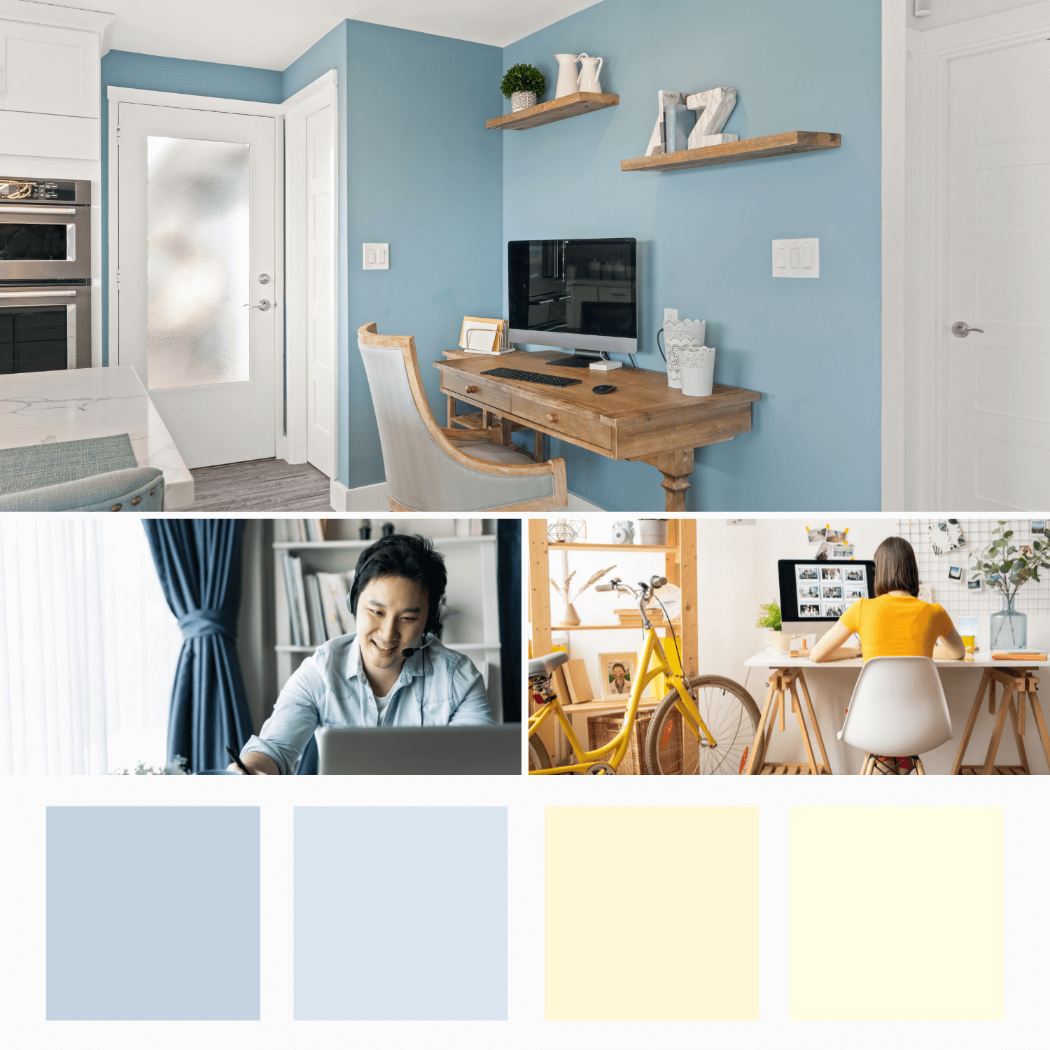
3 bedrooms, 3 baths and…where’s the office? The classroom? The gym? COVID-19 has changed how we live, work, and play—and what we look for in a home. Gone are the stringent definitions of a room’s purpose according to the blueprint. Extra bedrooms are now learning centers, the dining room is for quality time with friends, and the basement is the best hot yoga studio in town.
With homes becoming more functional spaces, the colors need to be comfortable and calm. Warm, soft yellows add a sense of sunshine to any room. To avoid veering into neon highlighter territory, go for pastel shades of chamomile or buttermilk to bring optimism and cheer without any glare.
The home isn’t quite as intimate as it once was now that we invite everyone from coworkers to teachers into our homes via video call—so now, you can create a space that shows buyers you understand their need to impress. While dark blues are the trademark of the corporate world, lighter hues like mist and sky reign over the residential realm.
Reclaimed materials stand out against strong neutrals
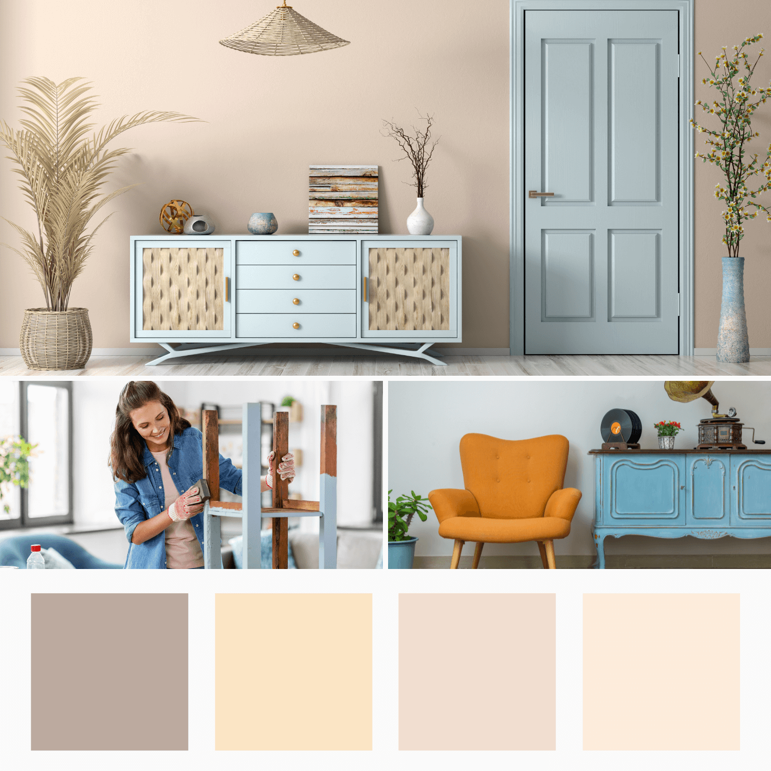
With the world so different from what we’ve previously known, there’s a newfound value in nostalgia. Luckily, second-hand furniture not only evokes warm feelings of remembrance but also ties into the movement to go green.
With supply chain complications still affecting the marketplace, there’s a resurgence of interest in using reclaimed materials as an anchor piece. Many second-hand stores offer refurbished pieces, painting over lackluster patinas with bold color palettes, geometric patterns, or ombre. You can always go the DIY route, too—but with more than enough to do to get your home ready, buying rehabbed pieces is a huge time-saver.
Go with neutrals for the rest of the room to show off a bold find. Beige may sound boring, but it brings connotations of dependability. In these ever-changing times, there’s nothing wrong with wanting to go back to basics once in a while. Plus, with varieties such as ecru, stone, and taupe, there’s nothing basic about this perennial staple.
Use Our Staging Tips for a Top-Dollar Home Sale
It takes thought and effort to bring your home to its full potential, so you can sell at the highest possible price. We’re ready to do a walkthrough and offer suggestions on how you can get prepared to sell. We have the experience and know what buyers want. Contact us today and let us know how we can help prepare your home for a top-dollar sale!